Now that I work from home I don't eat lunch out very often. It really has made me realize that lunch in cubicle-ville is more of an escape than a meal. Now I really have no need to get away because my work environment is peaceful, fun and my soundtrack is snoring kittens.
So when I do go get something it's because I really want it.
Last week, I really wanted Chipotle. I can't even remember the last time I ate there - years and years ago probably. And I do love their food.
My fave is the carnitas bowl. No beans, corn salsa, guacamole. MMM.
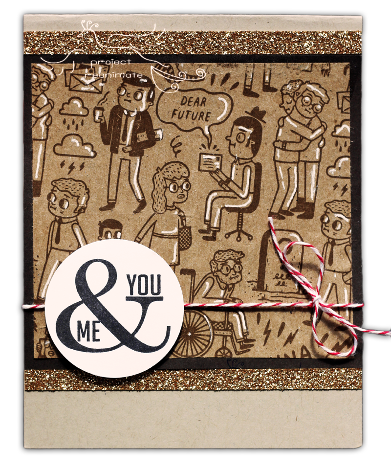
So I ran out and got this fave meal and brought it home. But I became quite distracted in the car by the bag - it's ADORABLE!!
It has these fun, quirky drawings on it that sort of have the whole circle of life on them.
Some of them are so sweet.
I couldn't bear to throw it away, so I added a few strokes with a white gel pen, a greeting from Perfect Pennants and a little twine and glimmer paper.